
UI/UX
Internship
CIPRA.ai
ROLE
UI Designer
UX Designer
UX Researcher
Motion Designer
Jared Leitner
Pohan Chiang
Haoyan Xin
Amelia Adam
TEAM
Jun-Dec 2024
TIMELINE
TOOLS


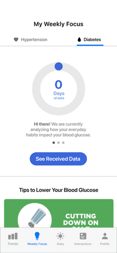
Designing an AI platform to transform users' health data into weekly recommendations to make managing diseases like diabetes and hypertension easier on patients
The main issue in this case study is that users were dropping off during the data collection process that is needed as the foundation for the weekly recommendations
The Challenge
The Solution
Through making the process more enaging, rewarding, and understandable to the user, we were able to make onboarding a smoother and more enjoyable experience.
BEFORE

AFTER
LET'S BREAK IT DOWN
UNEARTHING THE PROBLEM
Through self-directed user interviews, I quickly learned that the data collection process was a pain point for users early on within the onboarding process.
Additionally, managers who communicated with customers, both intra and international, emphasized that users were often dropping off during this process.
EARLY MANIFESTATIONS
I wanted to emphasize the data collection progress and make it easy to understand at first glance


This design was based on my research from other products such as Duolingo's progress bar
I then had the idea to make inputting data easier for the user to by adding a button that takes them directly to the data input area

OBSTACLE 1
Since keeping the text present in the mockups was important to my managers, I had to figure out a way to integrate large bodies of text and also make it look clean and seamless.
HOW I HURDLED IT
I made the text more interactive, where the user could swipe through the information to learn more about the data collection.
HOW I HURDLED IT
I tried a few different concepts based on research from apps that had similar concepts, but found that the tab fit best since it minimized clicks.
OBSTACLE 2
My managers wanted to implement a function for users that had comorbid conditions. This feature would mean that there would have to be two separate sections for each function, one for each condition.

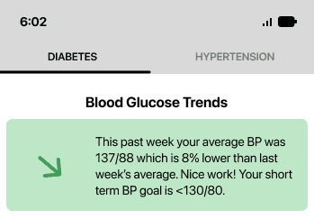


FINAL PRODUCT


REFLECTIONS
Because I was working with a cross-functional team, I had to learn the importance of effectively communicating my design choices as well as why they would ultimately improve the user experience.
Not shown in this case study are the numerous other iterations I made for this project. It's easy to fall in love with a single design and want it to make the final cut, but I had to remind myself that this thinking would pigeonhole me into a singular idea. I learned to keep an open mind to feedback and critique.
THANKS FOR READING!